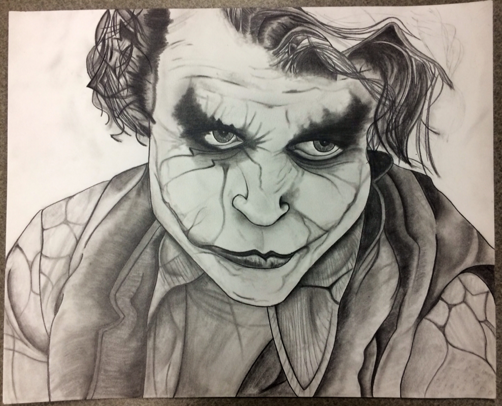
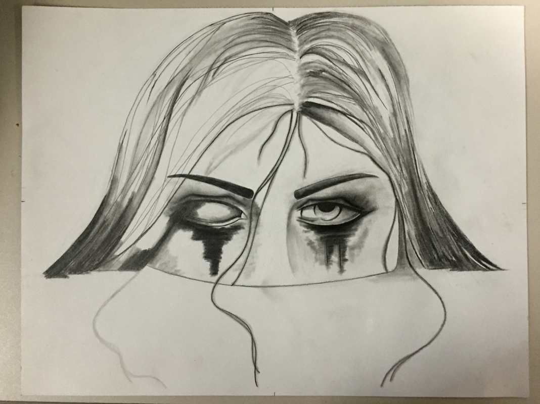
I started to work on this drawing again and I still don't feel like it looks right. I put if off last time because I wasn't having fun drawing it, it seemed like more of a hassle. Now I got a little farther in the drawing, but I feel the same way again. Anyways, I'm using graphite and creating value with a blending stub. Hopefully one day I finish it!
I was stuck and I couldn't think of anything to paint or draw, so I just grabbed some paints and started painting. I had no idea how it would turn out in the end, but it turned out to look like this! I think sometimes the best art is created when you just go with the flow. I have never created two pieces of artwork and put them together, but this time I did. I made the flowers separately then cut them out and glued them on my other piece. I lifted up the edges also so it made the flowers look like they are coming off the piece. I had a few problems such as creating thin straight lines and trying not to give up. I'm glad I kept going and didn't give up because it turned out kinda cool.
I've completed a few paintings since I last posted on my blog. The painting on the top left is done with acrylic paint. The other two paintings were done with watercolors. I prefer watercolor over acrylic because its easier to fix mistakes and it's easier to blend colors. I really enjoy painting, I never really knew I could paint so I surprised myself with these pieces!
The most valuable thing I Iearned in this class was to embrace your mistakes, you may even like it better when you're finished! I think this concept will help a lot of students in the future. This will give students the ability to create more instead of starting over if they mess up. This course has helped me feel more comfortable as an artist because I've had so much time to explore my abilities and challenge myself. You most definitely gave us enough time to experiment and try new things. You also gave us enough time to explore our interests, which I found I have a large variety of. Drawing B was very succesful for me! The artwork I chose to critique is called Bob Marley. The portrait was drawn by Hoang Huy and the medium is graphite. The artist used elements and principles of design such as contour lines and value. There is a lot of shading in the piece and that creates a shadow, this makes i feel more realistic. I notice a little texture created by cross hatching also. The story behind the art is the happiness and peaceful life that Bob Marley lived. The portrait is of Bob Marley laughing and smiling, and the artist says they want to bring that happiness to the world also. The theme is most definitely happiness. The artist was very succesful in expressionism. By drawing a portrait of Bob, he shows us exactly how he wants to make other feel, full of happiness, inner peace, and joy. I can clearly see the artists emotion by looking at their artwork. I named this piece Opposites Attract because I believe that this is true for people too. When I see red and blue the first thing that comes to mind is "hot and cold," which of course are opposite of eachother. It is very important to grow as a person. The concept of growth gave me the idea to paint the trees. With my thoughts in place, I combined my ideas to create two trees, one red and one blue. In a way these trees represent two people, although they have their differences, they grow together.
I decided to use acrylic paint. Painting is something I'm learning little by little and hoping to better by skills in. I used acrylic paint because I wanted to create a layered effect. I also gave the trees a little depth by using different shades of red and blue. I used bright colors and black to make the color really stand out. It's kind of an abstract painting and I'm going to paint white around the face, outline everything in black and fix the black spots. Then I'm going to cover the section with the face in it with black dots! A month later and I still haven't finished my drawing, I guess I'm just a perfectionist sometimes! I've created a lot more detail in his face, clothes, and hair. Of course as usual I used value and contour lines to create depth and I think it's really coming along well! I'm glad I've had time to practice and improve my realistic drawing abilities. For my next project I want to do something abstract and use a different type of media because I always use graphite. I decided to try using just sharpies! I used different sizes to make thick and thin lines. I looked at a picture and drew a skull. I'm really happy with how it turned out and also surprised at how similar it looked to the drawing I referenced. Another challenge accepted and conquered! |
Abby G.Drawing |